Compare/contrast
December 4th, 2011
Thanks everyone for your lovely comments about the Cornsilk Pullover. I’m happy to report that it’s been worn a couple of times since, and given the weather doesn’t know what it wants to do (yes yes, I know, I live in Melbourne), I’ll probably be able to wear it a few times more this year.
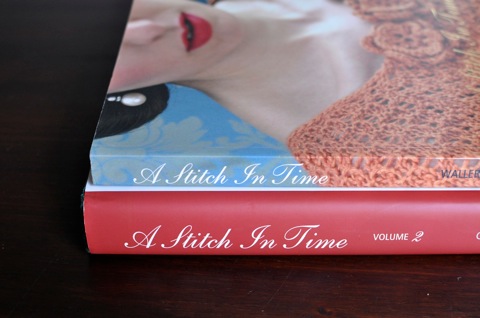
The week I finished my jumper was a pretty exciting week, knitting-wise, for the Pransell household. In addition to the jumper, a copy of A Stitch In Time Volume 2 landed on my doorstep. This wasn’t an accidental landing; I’d preordered it some time ago and had been eagerly awaiting its arrival.
It’s a really impressive-looking tome, with its hard fabric cover, dust cover and pages of matte, heavy paper. Volume 2 looks how I imagined Volume 1 would be if thicker paper were used for the pages.
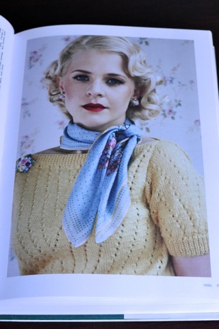
Like the first volume, the patterns are split into chapters based on the decade the pattern was from. Also like the first volume, there are quite a few things I would knit. Some of my picks include this top (which I have yarn set aside for):
and this ruffled top, with some modifications:
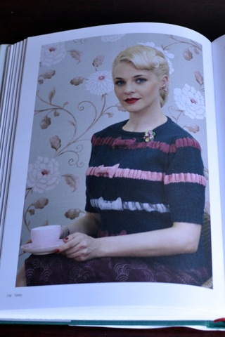
I personally wouldn’t make it with the bows. They are a nice feature of the top but just not my style. Instead, I’d make it monochromatic; the body in a dark grey or charcoal and the ruffled stripes in a lighter grey.
I only have two slight niggles about the book. The first one relates to the photography. The photography in general is really nice, but there are a couple of instances where the models’ poses or other bits of clothing get in the way of seeing all of the garment. As much as I think it could make for a nice coffee table book, it is ultimately a book of knitting patterns so the photos need to show how the garment will look when it’s finished. The other niggle, which is even more slight, is that the book itself looks a lot different to Volume 1. As they’re part of a set, it would be nice to have a version of Volume 1 that has the same physical specifications as the second volume.
Another nice feature of this book is the techniques section at the start. It goes beyond the basics that you usually see in knitting books which I thought was a nice change.
It’s a bit embarrassing to admit, but it’s been two and a half years since I wrote a wee review of the first volume, and I’ve not knit anything out of it. There are still a lot of things I’d like to make from that volume, I just have been terrible at getting round to it. In theory it won’t take me that long to get around to knitting something from Volume 2, because I’ve already got yarn lined up for a project.
If you have volume one of A Stitch In Time, I recommend getting Volume 2. If you like vintage knitting patterns, either to look at or to knit, I also recommend getting Volume 2. It’s a beautiful book with an impressive collection of vintage patterns. A real treasure.
December 4th, 2011 at 9:14 pm
Those books look interesting!
December 5th, 2011 at 4:31 pm
ive been hearing quite a bit about that book, i must go check them out. and i hate when publishers do that, im totally with you. volumes in a set should have the same look and feel. how hard can it be?! will be interested to see what you do get around to making from this one!
December 7th, 2011 at 6:34 am
You had me a ruffles! Thanks for the review.